Vacation Village
Brand Identity
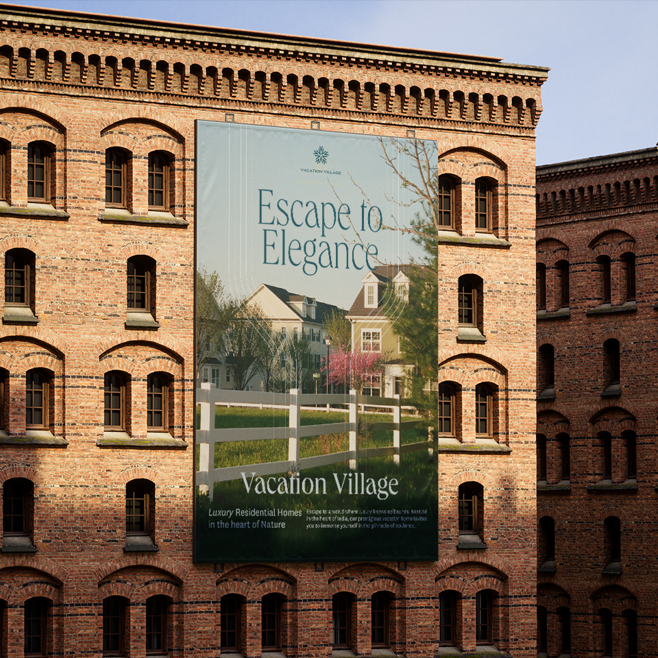
Vacation Village is a premium range of residential properties built and maintained by Agrocorp Landbase India. With multiple site within the country and the potential to expand globally, Vacation Village offers its customers the means to fulfil their dream of owning a second home.
I worked with Manpreet Seera and his team at NU Branding to develop an identity system for Vacation Village. We centered their Identity around building communities and growing together as one.
Year
2023
Collaborators
Manpreet Seera
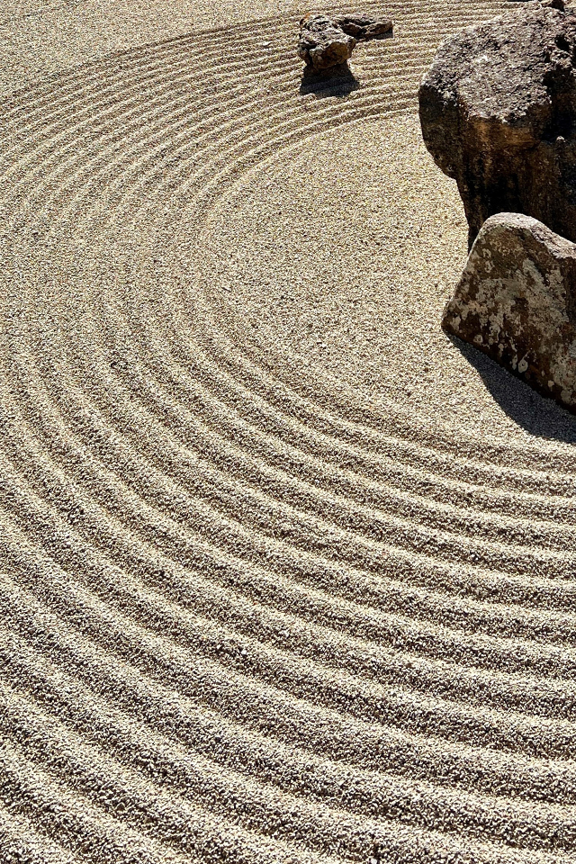
Built with the intention of being a retreat from the chaotic urban life, Vacation Village provides the space to recouperate and relax. It aims to provide peace and a healthy balance between work and personal lives of its clients. We looked at the different ways of manifesting peace in different cultures.
Images from Jeremy Thomas & Jennifer Goolsby (Unsplash)


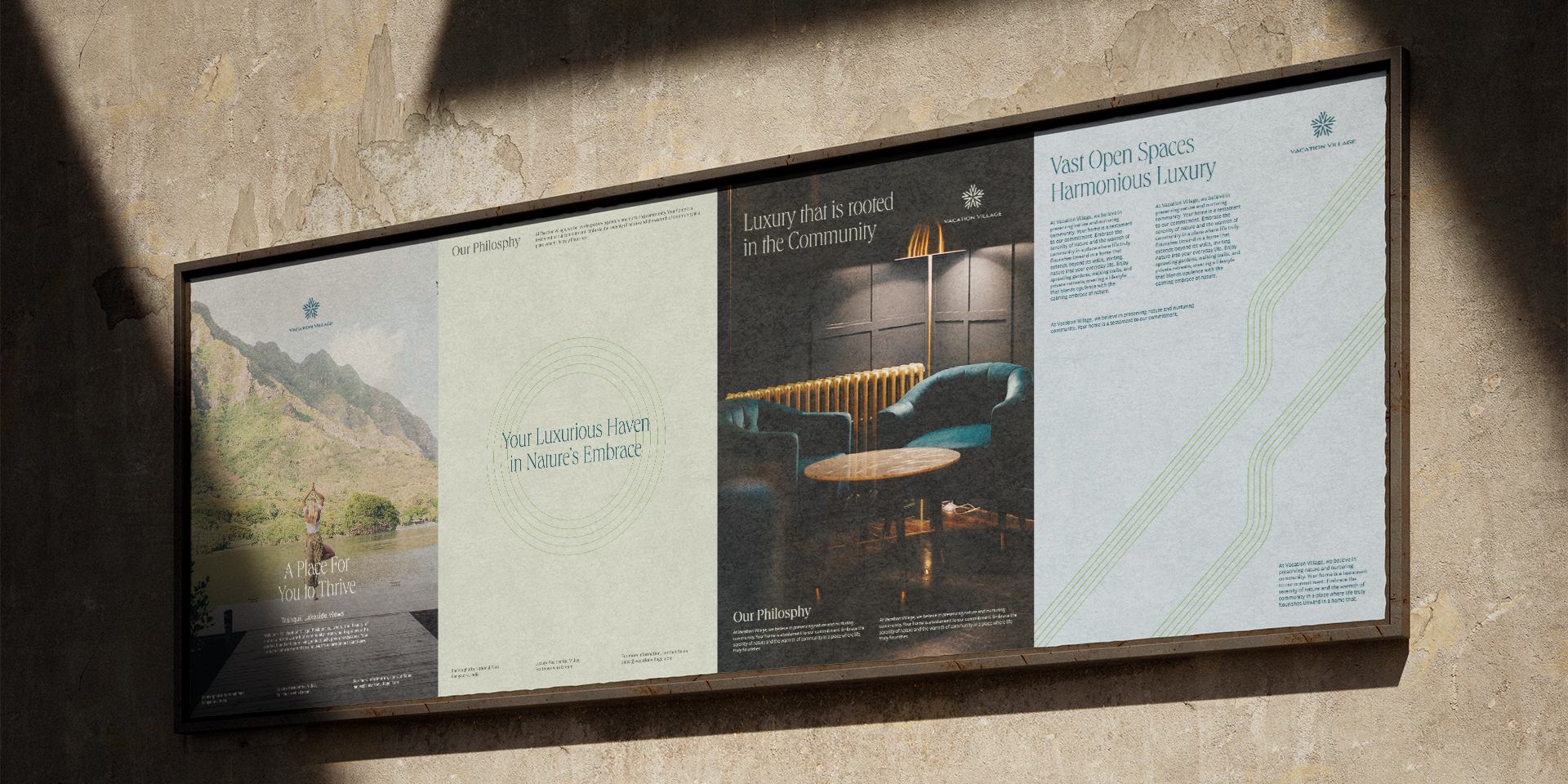
The premise of Vacation Village also serves as a place for people to gather and grow together, forming communities. We incorporated this aspect of the property into its identity.
Image by Hillary Ungson (Unsplash)
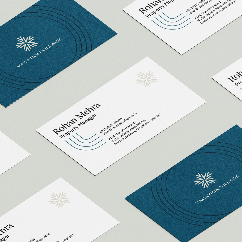
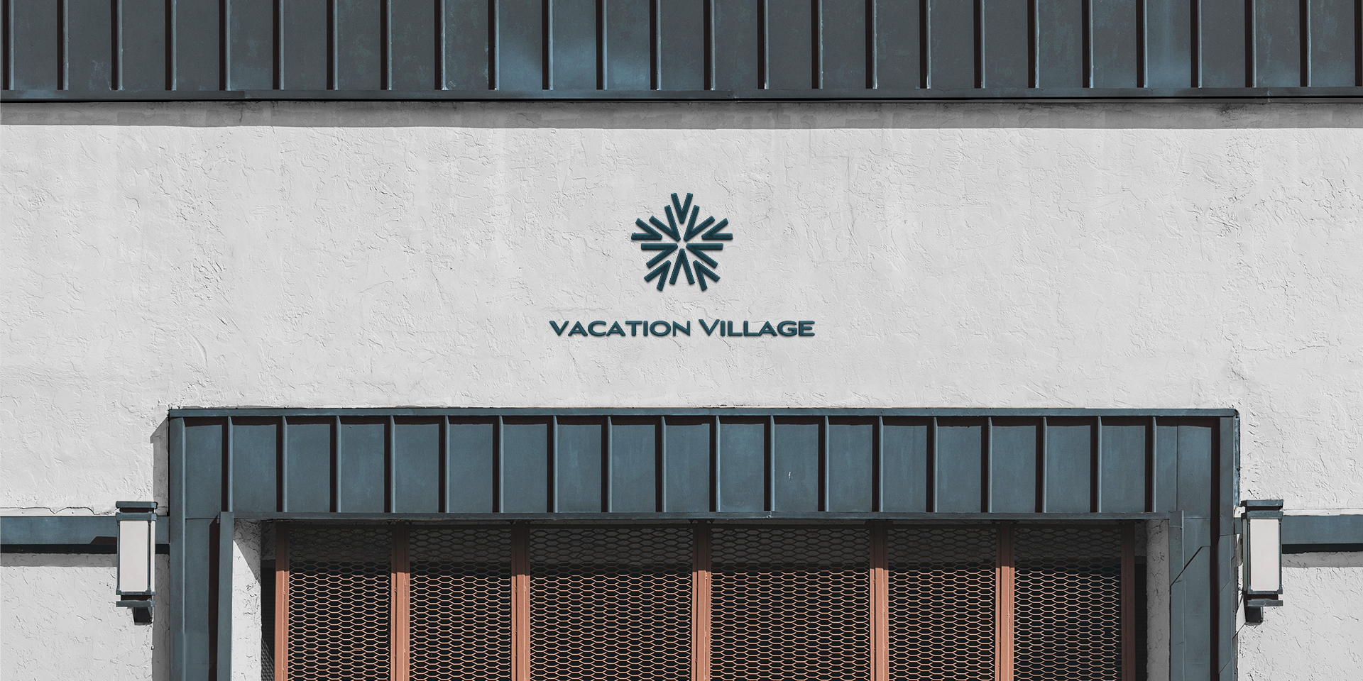
In Eastern cultures, balance is established by 5 elements of nature - Fire, Earth, Metal, Water & Wood. This 5 fold symmetry extends to the identifier and other aspects of the brand identity.
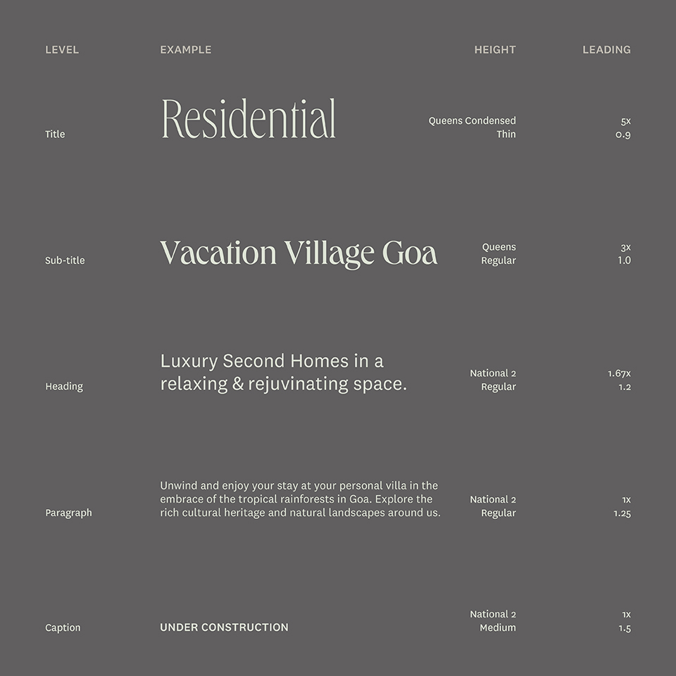
The Identity for Vacation Village is supported by two typefaces, Queens & National 2. Queens adds a luxurious and modern touch while National 2 keeps things clean and simple.
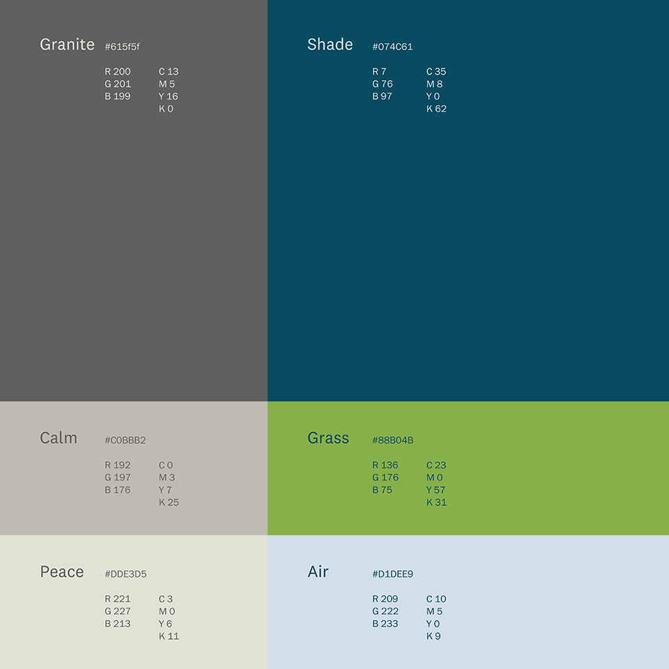
The colours for the brand were inspired by the healing effect of nature like the shade of a tree or a fresh country breeze. We also took inspiration from natural materials like granite.
I am a Graphic Designer, Photographer & Art Director from Mumbai, India.
Services
Brand & Identity Design
Website & UI Design
Editorial Design
Environmental Graphics & Wayfinding
Photography & Art Direction
Contact
Interested in working together? Feel free to reach out and discuss your ideas to see what we can bring to life.
© Soham Khadatare 2026
Mumbai, India